Portfolio
Branding:
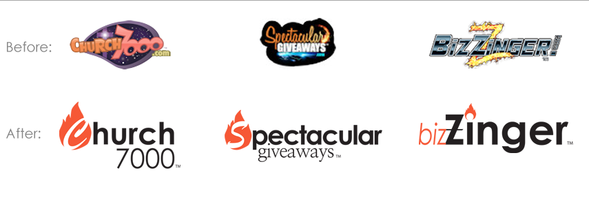
Challenge: Existing logos did not match the image needed for the intended market
Result: The Word Tailor created a temporary family logo system to bridge the gap between existing logos that were detrimental to presenting to the marketplace and the formal universal branding effort that is scheduled for summer 2015
Design:
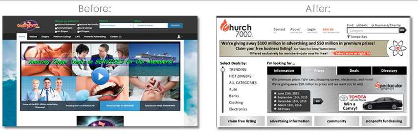
Challenge: Existing websites presented information for different audiences without clear identifiers creating mass confusion regarding the messaging. Additionally, the graphics and layout were presented in a manner which was below what would have been accepted by the intended market. The database functioned efficiently so a new layout/design must incorporate the existing database functionality.
Result: After completing a usability exercise, The Word Tailor created a new website design and layout incorporating the existing database function. The new design provides easy navigation, visual appeal, and clear messaging for each user group. In our standard methodology, we discovered hidden gems which allowed us to create additional revenue opportunities for the client. Overall, we improved perception, created brand consistency, and made it easier for users to interact with the brands.
Advertising Packages:
 Project: STRATEGY | BRANDING | DESIGN | MESSAGING
Challenge: The existing advertising packages had a naming convention that caused confusion and offered little value differentiation. In addition, the pricing was well below the perceived value.
Result: The Word Tailor stepped back and viewed everything from an advertiser’s perspective recommending and implementing the following: new advertising package names; new advertising package prices; new logo system for the advertising packages; additional value-driven inclusions in the advertising packages; compelling, benefit-driven copy; visually appealing and effective sales sheets; & identified additional revenue opportunities; all driven by market research & strategy. We also corrected the disconnect between sales & marketing by approaching the challenge from all angles to create a value-driven solution with consistent branding, messaging, & design.
Want more samples? Contact us!


